Landing guidelines
The landing page is a starting point for the user, you must encourage them to try your app and realize what benefits they can receive from it.
This section walks you through the recommendations for choosing a name for your app and writing a convincing description for it. When you write an app description, design the app icon and prepare useful screenshots to complete your landing page.
Submit all the information in a single file with the necessary formatting.
App name
The app name should adhere to the following guidelines:
- Reflects the core function and purpose of the app.
- Easy to pronounce and fits the marketing and advertising goals.
- Captures the attention and calls for the user’s curiosity.
- Is 30 characters or less including spaces.
If you have difficulties finding the right name for your app and need marketing assistance, make sure to ask your Account Manager.
Description
The app description is a marketing copy used to describe and explain the benefits of your solution. The quality of the written content directly influences the conversion of the page. Keep in mind who your target audience is and what use cases they could potentially have with your product.
The app description consists of four elements: the tagline, key benefits, detailed description, and pricing.
Tagline
The tagline is a line prompting the user to buy the app. It should adhere to the following guidelines:
- Have a unique proposition.
- Be a call to action.
- Is 92 characters or less including spaces.
Example:
Discover the next winning product for your Shopify.
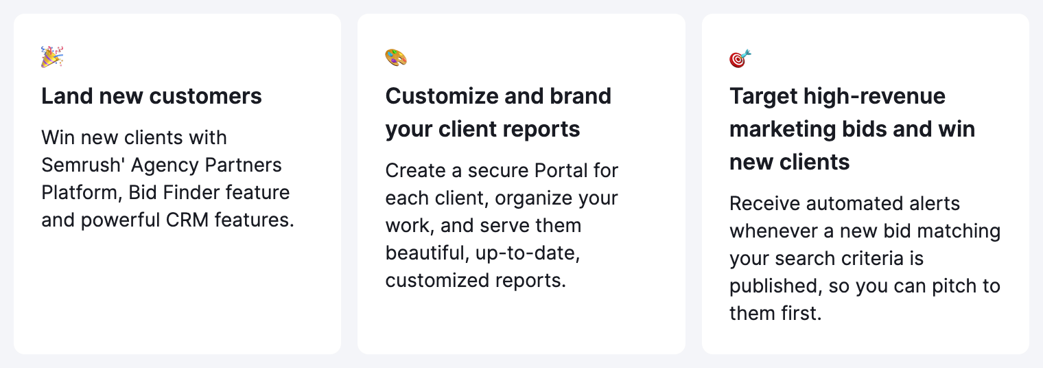
Key features
The key features is a section that focuses on three core jobs-to-be-done benefits of using the app.
Each key feature consists of an emoji, title, and description. The title along with the description should be up to 200 characters.
Detailed description
This description should be about the most common jobs-to-be-done with your app.
- List your features and how users can benefit from using them.
- Use from 1300 up to 2800 characters including spaces.
- Structure your text with headings and use relevant keywords and bullet points.
- If you want to put an emoji in the text, add them before submitting the text.
Example:
Do you have what it takes to build an unbeatable advertising strategy?
You might have the most appealing ad copy, the best visuals, and an incredible traffic manager, but if you don’t know what your competitors are doing, your advertising efforts can come to naught. Don't worry! Advertising Intelligence app has your back. This app delivers all-around insights on your rivals’ display, social, and video advertising campaigns and their performance.
Get an in-depth view of your competitors’ advertising strategies.
• Explore your rivals’ digital advertising campaigns and reveal their total advertising spend and share of voice.
• Assess their campaigns’ key performance stats—impressions, costs, views, clicks, and more.
Learn from your rivals’ hits and misses.
• Reveal competitors’ most popular messaging and visuals—and see what kind of engagement they produce.
• Find your competitors’ most valuable publishers and traffic sources by seeing the impact they bring.
• Pinpoint any campaign seasonality by reviewing launch date trends.
Use these insights to fine-tune your own advertising strategy.
• Find out how much your competitors are investing across channels to achieve their results.
• Analyze outcomes from various publishers and make a note for your own ad placements.
• Unveil your rivals’ most-advertised products and offerings, as well as the way they promote them.
• Create advertising campaigns that are set for maximum audience reach and performance.
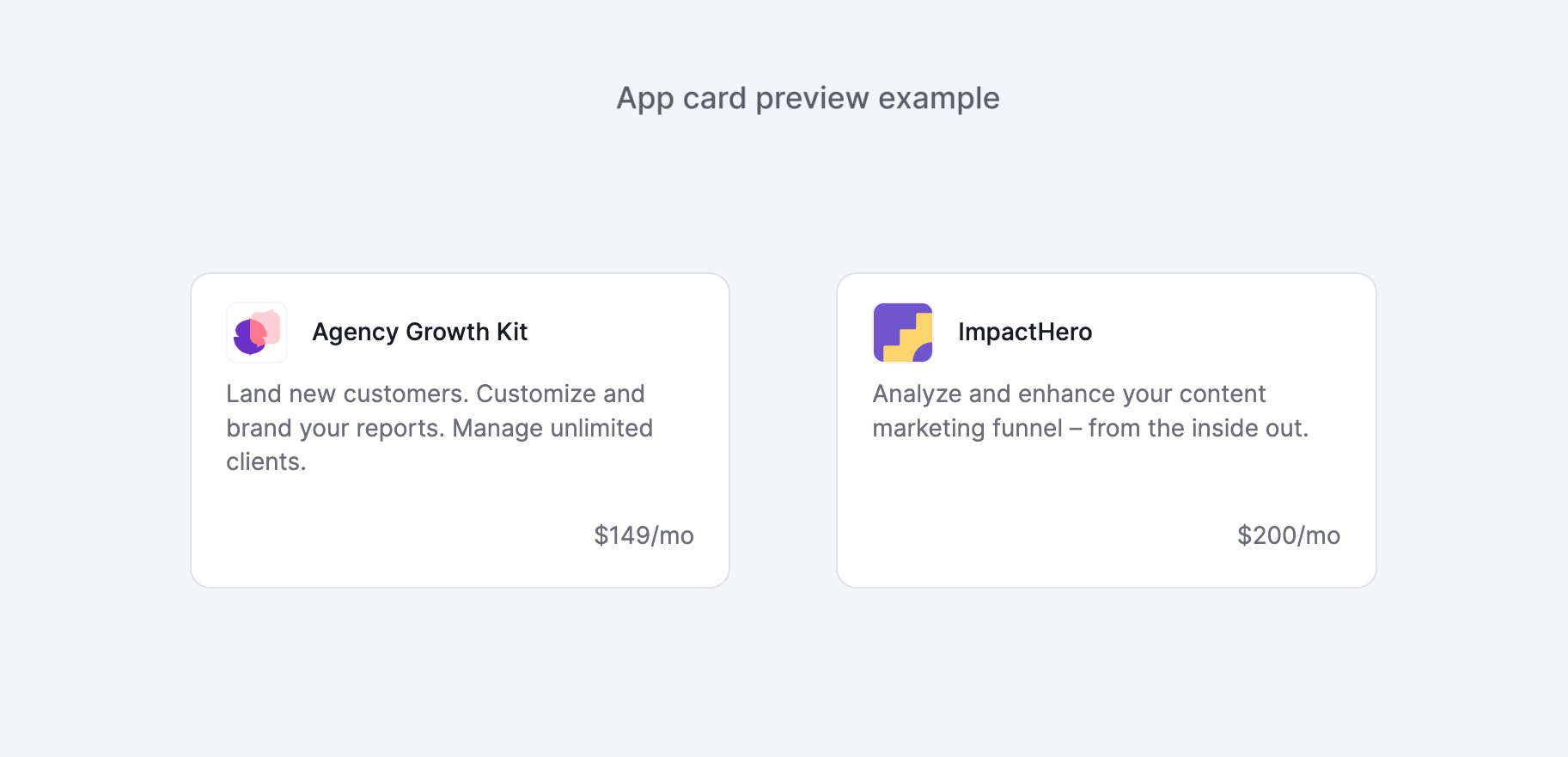
Pricing
Define the price as $/mo and describe what's included in the subscription plan. Include from three to five items in bullet points. The maximum length of every point is 58 characters
Examples:
Base plan
• Unlimited Manual and Visual Testing
• Test on Desktop and Mobile
• Physical Device Testing included
• Test from Various Geolocations
App icon
Every app needs a beautiful and memorable icon that attracts attention on the App Center pages. Your icon is the first opportunity to communicate at a glance, share something about your app’s purpose. An icon also makes the app notable throughout the system. The following guidelines help you with your app icon.
The app name should adhere to the following guidelines:
- Use the PNG format.
- Size: 256px.
- Don't round the corners - App Center does it with the CSS property.
Simplicity
Find an element that captures the essence of your app and express that element in a plain, unique shape. Add details carefully. If an icon content or shape is overly complex, the details can be hard to discern, especially in smaller sizes.
Recognition
Users shouldn’t have to analyze the icon to figure out what it represents. For example, the Mail app icon uses an envelope, which is universally associated with mail. Take your time to design a nice and engaging abstract icon that artistically represents your app’s purpose.
Background
- Keep the icon background plain and avoid transparency.
- Make sure your background doesn’t clutter the main form.
- Don’t make line borders.
- The icon shouldn't overpower other app icons nearby.
- Don’t fill the entire icon with content.
Text
Don't use text in an app icon.
Photos, screenshots, or interface elements
Photographic details and screenshots are very hard to look at in small sizes. They're too complex for an icon and don’t help communicate with your app. Interface elements in an icon are misleading and confusing.
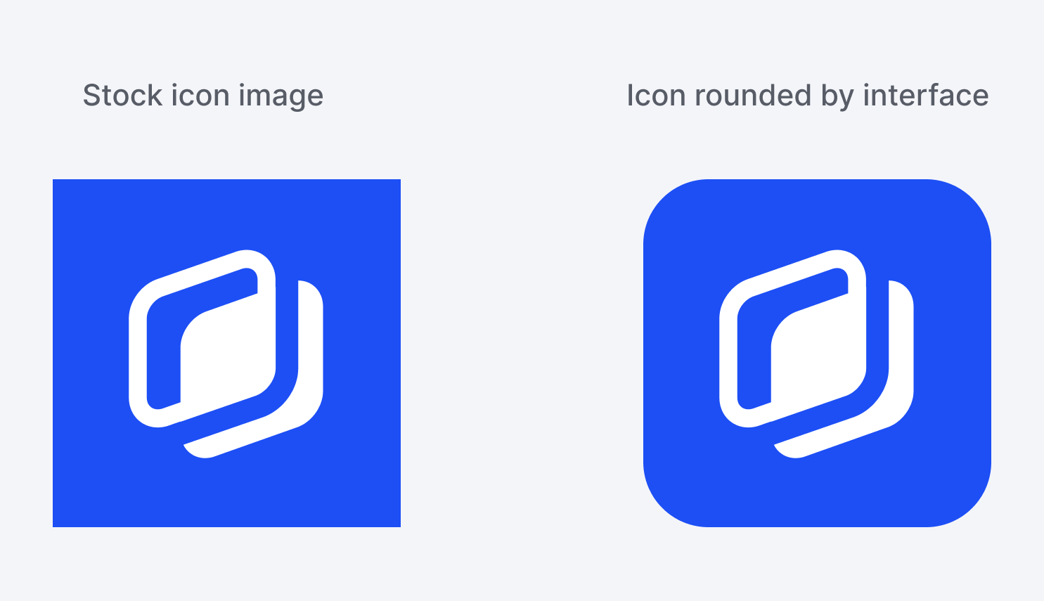
Corners
The system applies a mask that rounds icon corners automatically.
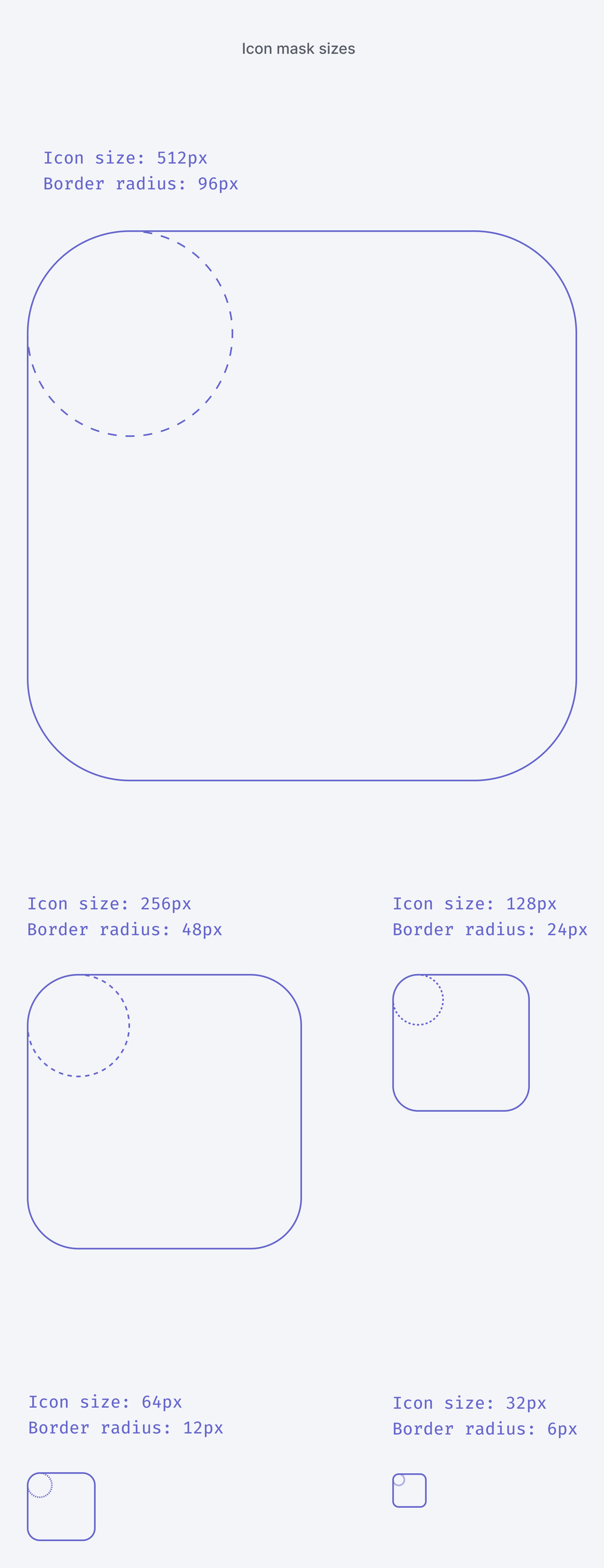
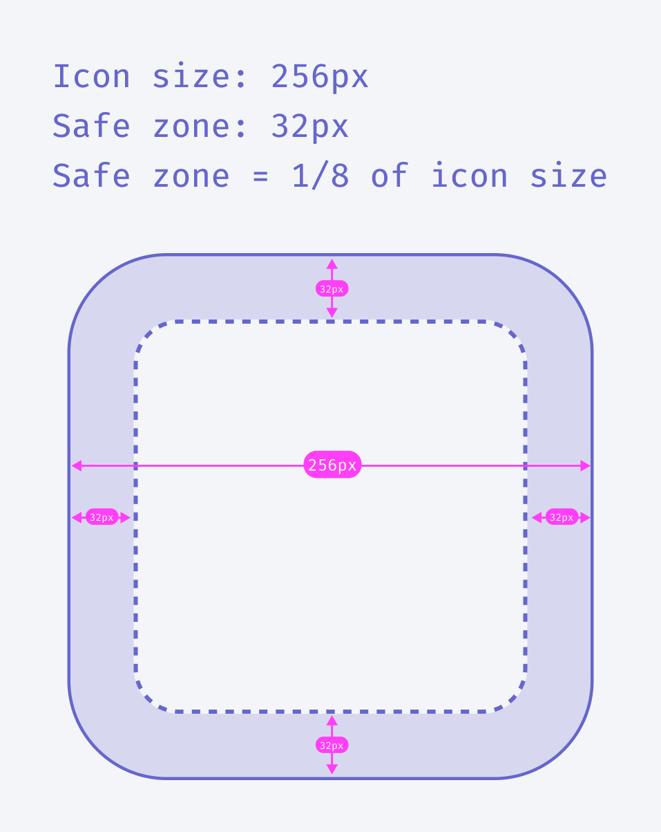
Safe zone
Use a safe zone for an icon where rounding corners might cut off some important parts of the image.
Find more examples in the Semrush App Center:
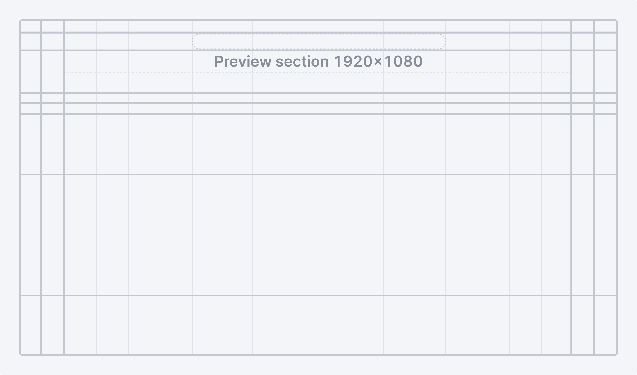
Screenshots
The main goal of screenshots is to tell more about the app. The following recommendations help you with your screenshots:
- Use the PNG format.
- Resolution: 1920x1080px
- Size: 200 KB or less.
- The maximum number of images in the gallery is 6.
- Don't round the corners - App Center will do it with the CSS property.
- Show the actual app interface to avoid misleading potential users.
- Don’t show the whole interface of the app. Focus on the main advantages and key features.
- Use your brand colors for backgrounds if you need to make the screenshot more colorful and connected with your company’s brand.
- Add one or two lines of text to describe usage of a feature or a part of the interface. Make sure the app screenshot is still the main element that occupies no less than 80% of the image.
- Provide alt text for your screenshots. Learn how to use alt text.
- Make sure that the name of your screenshot is related to its content. For example, don’t make it
1.png, name itmanage-multiple-channels.pnginstead.
Use the preview section grid to fit your screenshots in:
Here are some examples:

Use alternative composition only when it helps to show needed features or UI elements, not just for marketing purposes:
